Character design in my first book
A look at the character notes and designs for the cast of The Biggest Smallest Thing
As I mentioned in my brilliantly written last post about how I started working on my first picture book, I am nosyyyy. That curiosity is maybe also powered by a sneaky feeling that there’s some sort of guaranteed secret to publishing success that everyone knows except for me, but I digress and that’s for another newsletter or voice message to a friend. As I was saying, I want to know about everything that went into making a picture book, so I’m doing my best to talk about it now that I have one traditionally published picture book under my belt. (pause for applause)
And this time I want to zoom in on one of my favorite things: character design and why each character looks the way they do.
But before we do that I need to mention that at the very beginning of this process, I firmly believe a small pigeon hid under my teeny tiny hipster beanie and started making all the creative decisions for me. I know it sound ridiculous, but how else wound you explain the uncharacteristically optimistic moment when I considered making this book entirely traditional?
My first book with a publisher.
Not a 32, but a 40 page book.
When I had almost no experience with any paints.
See? It makes so sense. Tiny pigeon decisions.
Luckily one of the first things I had to send along with the character designs was a sample page to show my style plan for the book. And while making this I realized that I would absolutely NOT be able to make this book entirely traditional for two main reasons:
1. I am not quick enough to meet the deadlines and not even sure how much time I’d even need. 2 more months? 5 more years? No idea.
2. If any adjustments would be requested I would burst out in tears because I’m not Photoshop-skilled enough to be able to make changes as quickly as I could with digital work.
So the only reasonable compromise was to make it digitally and do my best to use textures and stuff to not have it look too digital.
The tiny pigeon hiding under my beanie had gone quiet so then I could get into character design, which is one of my favorite parts of making a book. When I got started, the Art Director that I worked with, Sam Tse, sent me the full manuscript, along with notes about each of the main and secondary characters. And this cast was right up my alley.
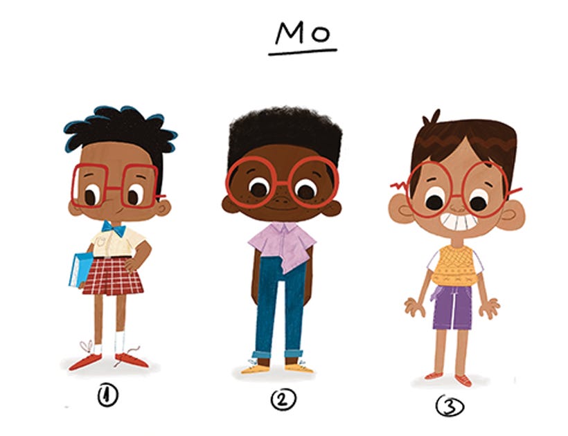
Here are the character notes along with the design options I proposed for each of them:
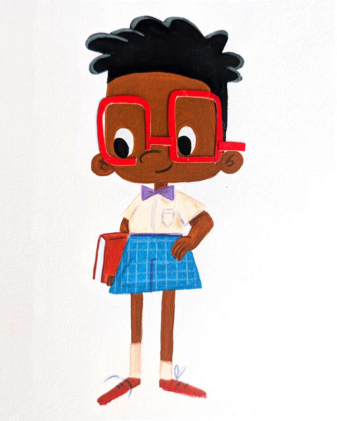
Mo (Age 7)
Mo is the kid version of the absent-minded professor; however, he underestimates his own absent mindedness a great deal, while at the same time overestimating his professor-like qualities. Perhaps he always has a section of sticky-up hair, an inside out pocket, a shoe untied, a shirt misbuttoned, or some other visual tell that kids will relate to and begin to associate with his character.
Key words/phrases: absent-minded, messy, confident, tries to appear older than he is.
Muriel (Age 7)
Muriel is intentional in a quirky sort of way. Though she isn't bent on winning, she still cares about details and how things could be. We see this in the way she draws, how she cares for inanimate objects (i.e. bread), and how she dresses. If she decided to wear her shirt inside out, it would be just that--a decision. Muriel is a noticer, and little things make her happy. She is bright eyed, a tad mischievous, and kind and quirky, almost to a fault. She is less a daydreamer, and more highly engaged with the present. And, she absolutely loves cats, along with more unlikely animals, insects, rocks, and condiments, particularly mustard.
Key words/phrases: artistic, detail-oriented, expressive, mischievous, intentional — I imagine her to be put-together with some cute accent pieces.
Ms. Rawlinfort (Age 30+)
I'd love it if she broke some of the stereotypes of teachers in books so..not tall, thin, white, and preferably not motherly, cutesy, or Ms. Frizzle-y. No note on age; anywhere between 30 and 60.
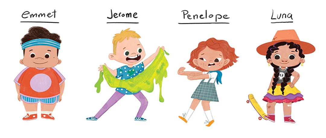
Since the secondary characters didn’t play such a major role in the book and I was fairly confident in the designs I had, I only proposed one design for each of them. And they all got approved, with minor tweaks.
Emmet (Age 7)
Key words/phrases: athletic, lazy, (his talent is sprinting).
Jerome (Age 8)
Key words/phrases: Gross, showboat,(his talent is making noises with his nose/body)—imagine the type of kid who makes farting noises with his armpit.
Penelope (Age 7)
Key words/phrases: musical (her talent is playing the recorder).
Luna (Age 7)
Key words/phrases: (maybe don't make her traditionally girly; we don’t want to positively enforce stereotypes—she is described with the following: Luna smelled pleasantly of lemons and could eat a popsicle in three bites.), her talent is baking.
I’ll end this already chunky post by saying that a lot of thought and research went into each character before they turned out like they did. Luna for example was heavily inspired by the rad womxn of ImillaSkate, an indigenous Bolivian skateboard collective. And although we couldn’t keep the hat or include the skateboard, I like to think she still kept her skater attitude.
I hope this was a nice read for all you nosy newts and looking forward to talking to you next time.
Take care!
Ana


Hooray, your first pb!! Congratulations, can’t wait to see it around!